Craig Lynn, Co-Founder and Director of Glasgow production design house Filament, discusses the importance of staying focused on the user experience when designing Internet to Things (IoT) devices.
An approach to IoT and connected hardware is often tech driven, however technology for technology’s sake has never been a proven model in developing lasting, successful products.
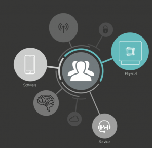
At Filament, when we’re approaching IoT from a product design background we always place the user at the centre of the development. User experience (UX) becomes the nucleus at the intersection between hardware, software and service.
So why is UX so important for IoT and connected Hardware?
As the lines between hardware, software and service blur, we must rewrite the rule book for good product design. Here are five lessons I’ve learned working on connected device projects over the past few years:

- It’s all about the user
Even before you start developing you should ask the question “Is there a user need based on ‘real’ user insights”? If the answer is no then it’s time head back to the drawing board I’m afraid. Once you’ve established the need then it’s time to go deeper, really get to know who you are designing for as sometimes innovation can come in the subtlest of insights from the ‘real’ not ‘ideal’.
One great aspect of IoT is the closed loop feedback system generated by a connected device. Gone are the days of ‘sell and forget’, the product development now extends far beyond the shipping of devices. Adopting a ‘Connect, Engage and Improve’ mantra means you can monitor usage (on mass) and in real time to learn how to improve for the next generation. Tesla are leading the way with this with Elon Musk responding to some customer ‘complaints’ on Twitter with hard fixes implemented in software updates within six days!
- Crossing the divide
Every element of UX is a manifestation of your brand and as such there needs to be a consistent message that translates across all touch points including (physical, digital and service). If your brand’s core characteristics are reliability and strength then this needs to be communicated beyond your shiny logo. The physical hardware has to be ‘clyde built’ engineered; your comms need to be reliable even in the most challenging environments; your service needs to deliver on time and as promised otherwise a void starts to open up between your brand identity (what you say you are) and your brand perception (how others see you). Designing for the core values across physical, digital and service is key to not only grow a brand but to maintain its integrity in the market.
- Question of taste
We humans are a fickle bunch, although users may have the same needs they don’t always have the same tastes.
We often judge software purely on functionality and not style, when have you ever heard someone say “I don’t use Virgin Media as the UI doesn’t go with my living room décor”. However when you move into the physical realm, in both the consumer market and more lately in B2B, visual taste becomes one of the main psychological motivators and barriers for purchase. It’s not only the industrial design (styling) of a hardware device that can put the users off, every aspect of the interaction needs to be carefully considered with a level of personalisation offered to suit the tastes of the many.
When we talk about personalisation of UX we’re not solely referring to switching the fascia of your new smart thermostat, it’s adapting interactions to the user’s requirements (B2C) or business requirements (B2B). Personalisation can, and should, be offered in physical, digital and service. The iPhone is a good example of successful personalisation:
- Physical: It comes in multiple sizes, colours/finishes. Cases can be added for the more extreme personalisation.
- Digital: The home screen allows you to choose, position and group shortcuts to apps to ensure less clicks/swipes to your favourites apps.
- Service: Supplementary services such as iTunes and Apple Pay are easily integrated and can be seamlessly used.
Studies over the years have shown that a level of personalisation/customisation can actually increase sales however care must be taken on how to implement these options to avoid purchase paralysis.
- Smoothly does it
Humans are also stubborn when it comes to UX, the old saying “you can’t teach an old dog new tricks” applies. If the interaction or experience is new and requires learning then this adds a certain level of friction which in turn creates apathy. The key to good UX design out the friction. Interactions that are inflexible and dictatorial in nature don’t tend work. Interactions that are intuitive and flexible prove to be more successful.
So how do you design for intuition? Co-creation is key. Bring your users into the development process, observe them, speak to them. Produce prototypes and mock ups and get them to test and provide feedback. Treat this process as an iterative one, with each prototype you’re sanding down the rough edges of the interaction until it’s silky smooth.
- Uninterrupted
Today’s world is 24/7 365 and we expect that from the products that we interact with. We expect our connected hardware devices to be ‘up’ and ready at a moment’s notice. This doesn’t only affect the power strategy but, in a connected system, all aspects of the comms, security/authentication, data processing and storage. One kink in the chain and the whole system can fail. Products with good UX can change user behaviour and maintain this if they are uninterrupted but we’re creatures of habit and as soon as the interaction is interrupted (be that from lack of signal, battery or downtime in the service) then we quickly slip back and don’t get the true user benefit the device was designed for in the first instance.
Early energy smart meters suffered badly from this. At the start they were novel, they would be checked daily if not hourly. Lights would be switched off, heating turned down, cash was saved. Then there was the plateau, the device became less interesting and ultimately when the batteries died, this interruption meant that the meter found its final resting place in the back of a drawer. Over the passing weeks the good work would be undone as the user slipped back into their bad habits.

Summary
So if you are developing an IoT or connected hardware product that is tech led make sure you don’t consider the user experience as ‘nice to have’ feature, it should be imperative to the strategy of the product from day one.
Filament’s team of designers, engineers and strategists specialise in the development of IoT and connected hardware devices. Follow Filament on Twitter.